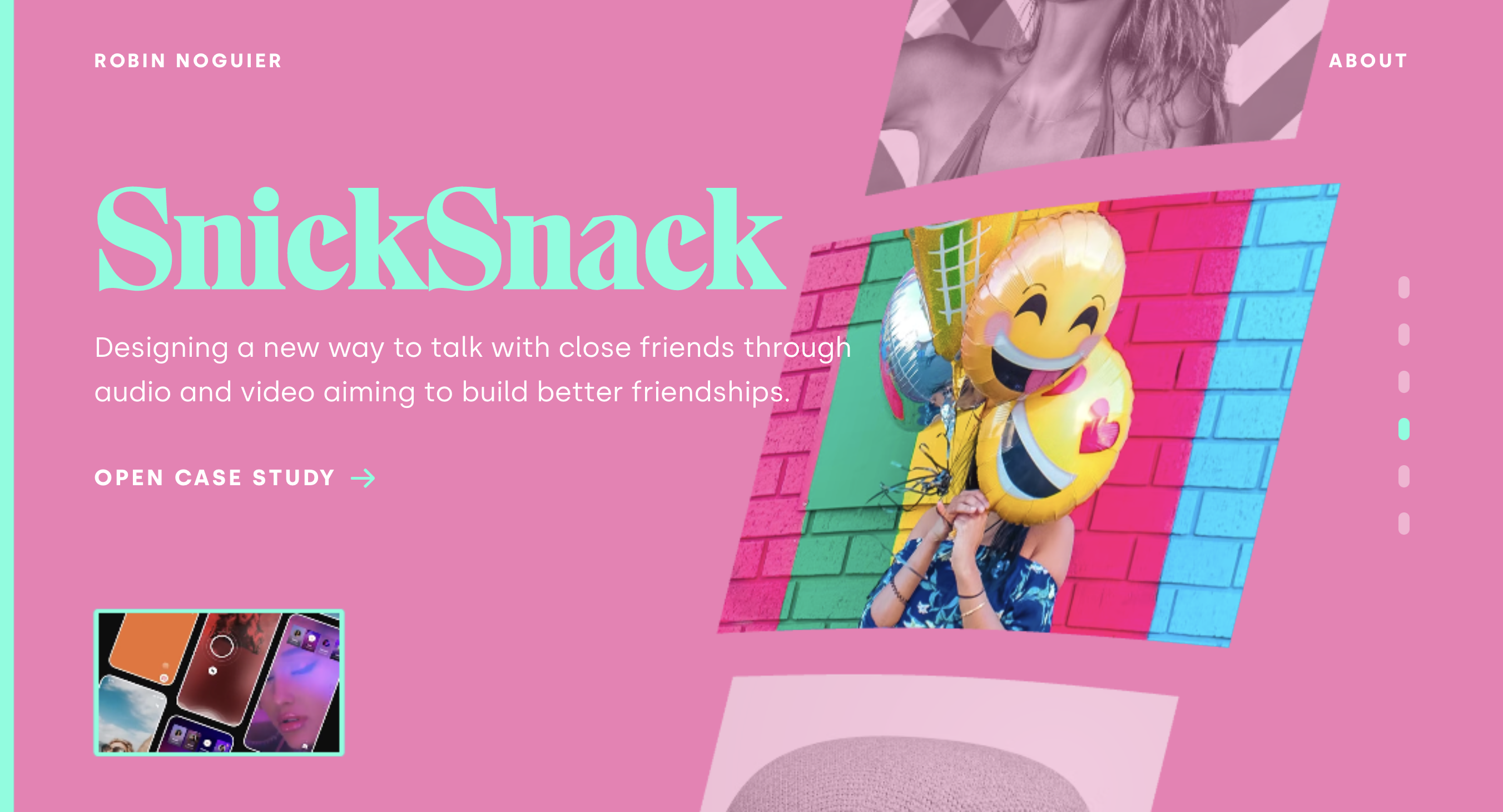
The designer’s website is as eye-catching as it is interactive and wonderfully executes several changes in view perspectives and color schemes when scrolling. The diagonal project icons and project links are a lot like my site map's table of contents design style, which made it especially cool to see fully complete and materialized. Such an artistic choice creates a dynamic and intriguing direction for the viewer’s eyes, attention and ultimate comprehensive understanding; thus creating a memorable user experience.
The designer’s website appeals to an audience that enjoys a playful and interactive flow between pages. It’s also a site that is only desktop compatible- which is a wonderful example of a supremely intentional artistic choice that appeals to users (who may very well initially be on cellular and tablet devices) who appreciate the allure and exclusivity of the hunt and drive to open the site up on a computer desktop setting. Brilliant!
The designer’s project links are bold — a design choice that was executed fabulously. The links lead the website viewer to a detailed brief on the designer's design process which demonstrates to viewers how to effectively deviate from the more traditional page layouts and structures we so often see on sites. I also happen to love the designer's choice in typography.